POINT BLANK
PRODUCT DESIGN (NEWS/MEDIA)

"Empower Your Vote, Know the Point Blank Truth!"
Gen Z are values-based voters motivated by a protection and expansion of basic rights. However, less than half of young Americans plan to vote in 2024 - Harvard Poll
Finding Our Obstacle
Provide an engaging platform that educates young voters about the political climate in 2024 in a way that motivates them to vote.
The app should be designed to be informative, interactive, and easy to use, and it should aim to address the lack of engagement and knowledge among young voters about the political process.
Uncovering Gen Z's Disillusionment with Politics
We began with the MAIN OBSTACLE: what about politics is so off putting for Gen Z?
The team brainstormed questions such as; Is it the two party system, lack of understanding, overall displeasure, or biased media?
Wanting to figure out the main pain points we began user interviews and surveys to pinpoint concerns.
Our objectives included:
Identifying challenges when engaging with political media sources?
Exploring the capacity of online platforms to involve and rally potential voters,
Defining how prospective voters lack crucial election information, including registration procedures, polling locations, and key dates.
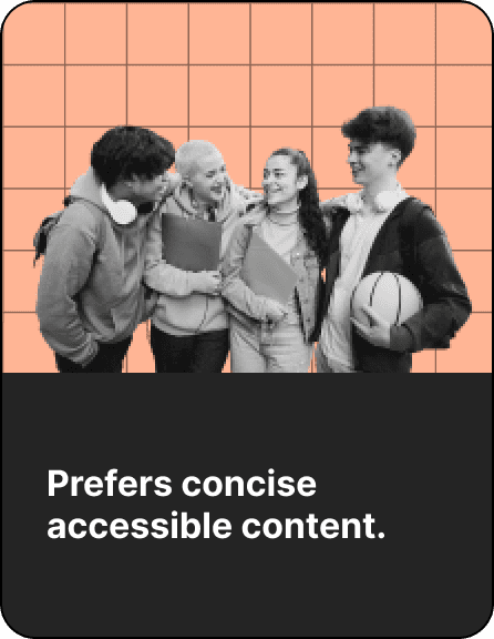
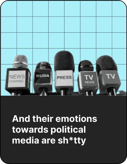
We discovered that Gen Z...
Developing Unbiased and Digestible Political Content for Engaged Civic Participants
So our main goal moving forward as a team “How do we remain unbiased, but focus on giving user's all the information?”
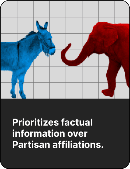
To accomplish this, we rigorously examined our biases and deliberated on the inclusion of outlets with contrasting biases. It is imperative to rise above party affiliations in the pursuit of objective truth.
Ultimately, we’re developing a product for Young engaged civic participants seeking digestible, impartial and credible political content to further their support and understanding of local and national politics.
Uncovering User Needs and Rethinking Strategy: A Deep Dive into Competitor Analysis and User Personas
To continue understanding our users' needs we moved onto scouting out competitors. The good, the bad, the fugly.
From that we decided to move forward with our initial plan of addressing bias in our reporting, but also including a gamification feature, and DEFINITELY including local government highlights since there was lack of local representation.
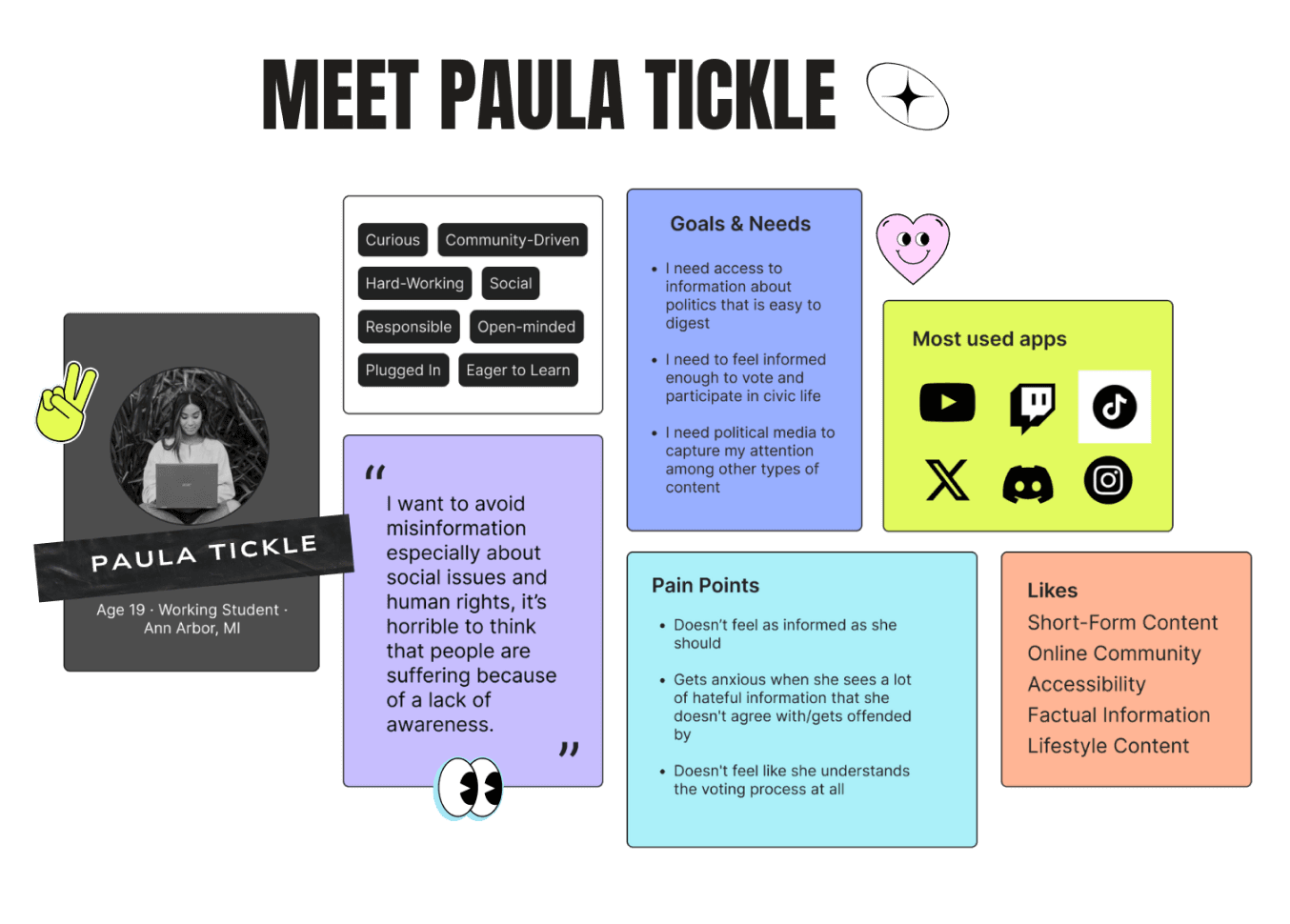
With our findings in hand we then identified our user who we could go back to if we needed to recenter our strategy. “Paula Tickle” was all of our key findings from multiple interviews into one person. And she was on a goal to get informed and take action at the polls.
How Might We Maximize User Engagement and Empowerment through Point Blank
Using rapid brainstorming to compile all of our ideas (which were a lot) into a board we utilized dot voting to get an idea of what we should tackle and build out in our app.
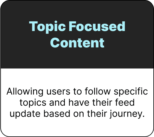
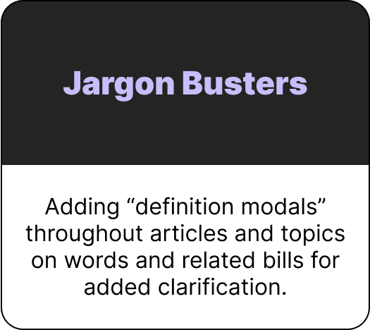
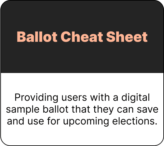
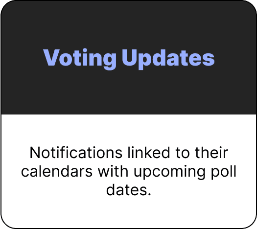
Through mapping and utilization of a 2x2 Prioritization matrix we landed on five features that addressed previous challenges our participants have encountered while also enhancing user engagement, providing rewards and foster a sense of empowerment through Point Blank:
Enhancing User Engagement and Political Participation: Mapping User Flow and Incentivizing Interaction
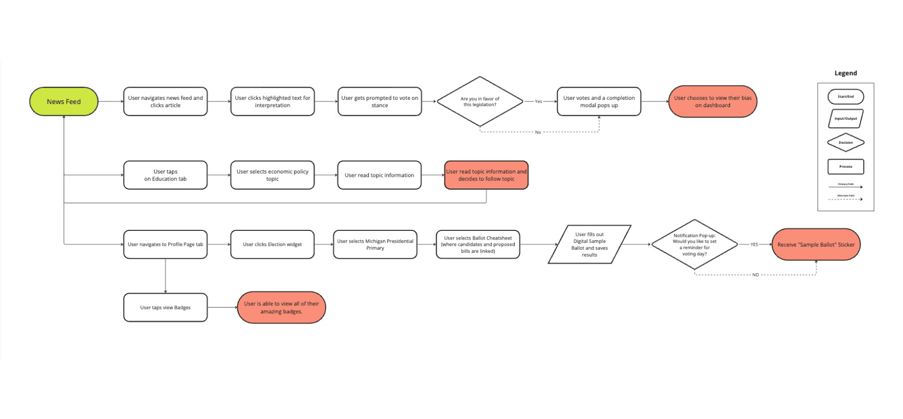
Through assumptions we mapped out our user flow where we aimed for users to visit the home page and select a current article relevant to their local area. Ideally, this initial engagement would pique their interest in a particular political subject, prompting them to delve deeper and track updates on the topic in their personalized feed. Furthermore, we intended to offer users the opportunity to fill out a sample ballot for an upcoming primary election and receive a corresponding "reward. To keep them engaged and motivated to continue their journey"
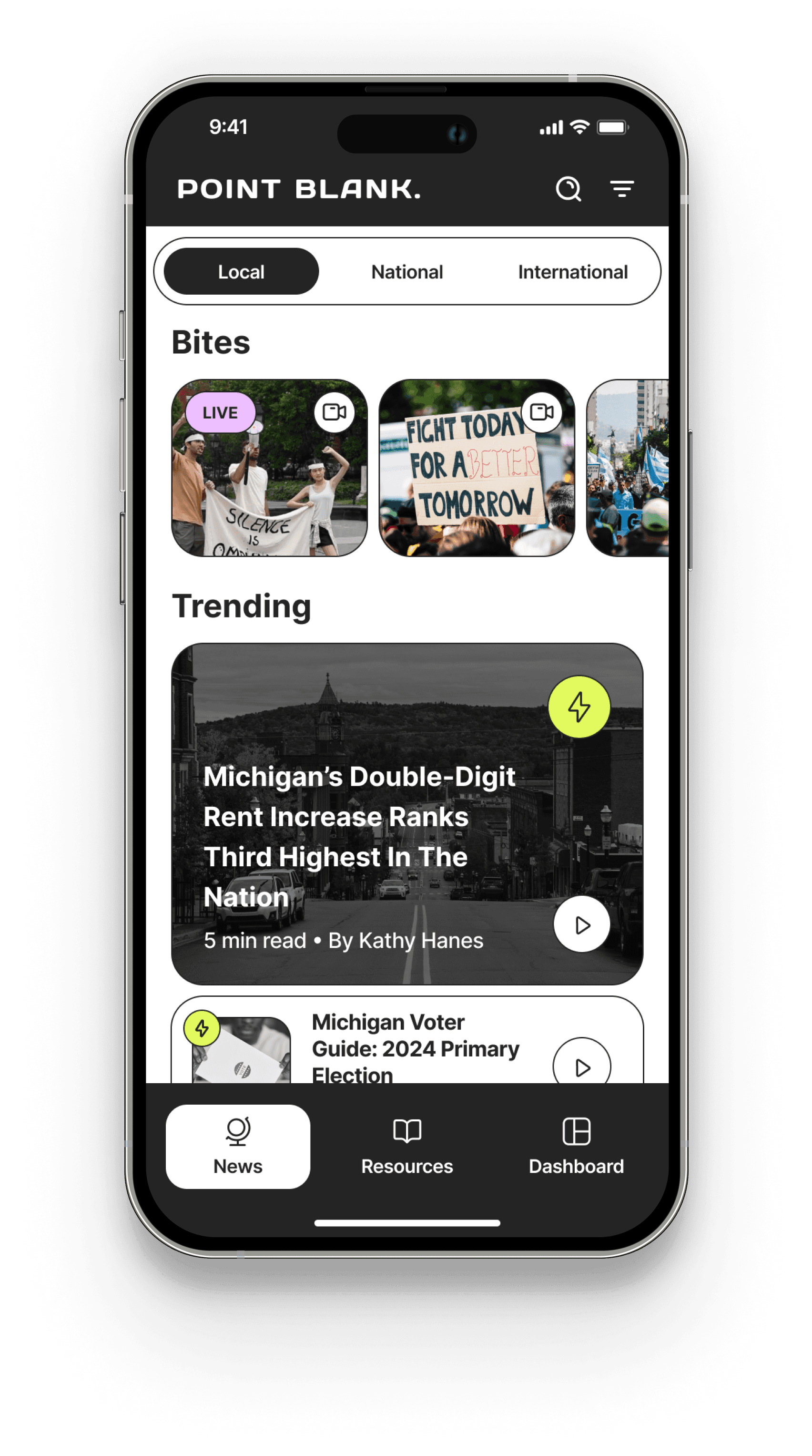
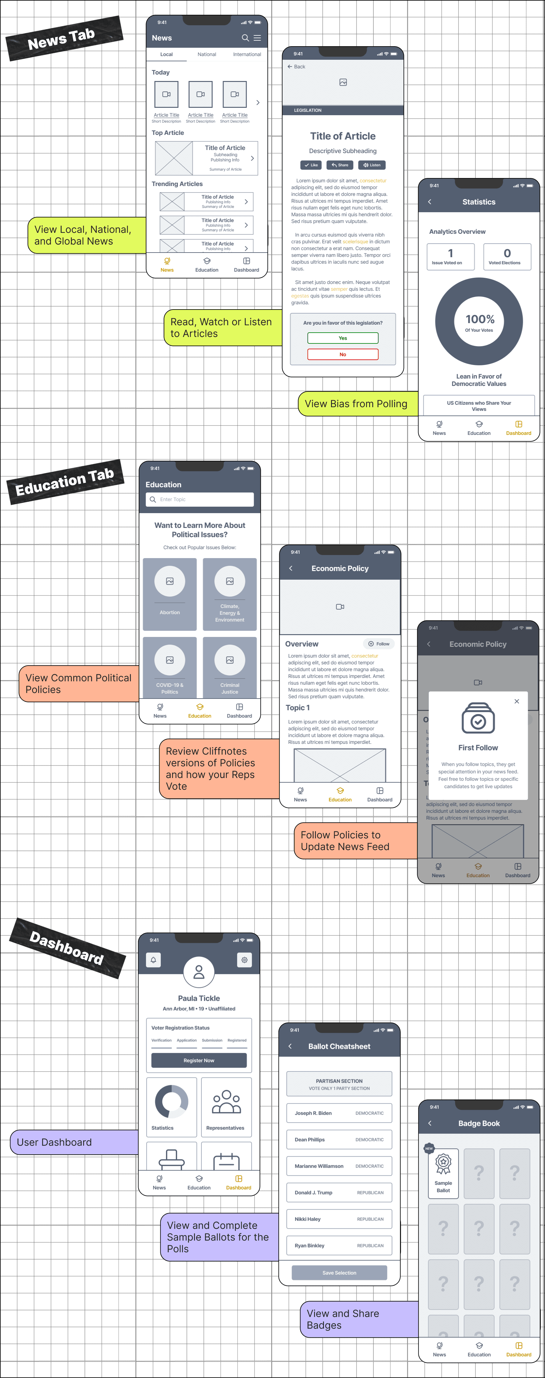
Once our framework was finalized We started building our wireframes aimed to establish a central platform where users could access news content at local, national, and global levels.
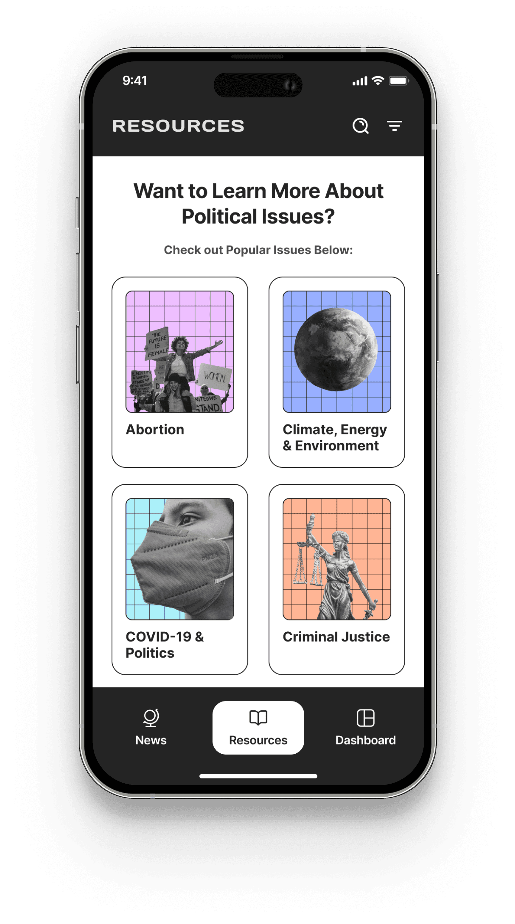
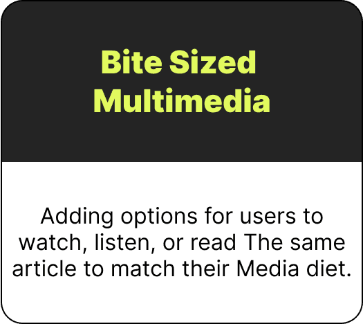
Users were given the flexibility to read or listen to articles and watch concise video segments referred to as "Bytes." Within articles, users could discern biases and look up unfamiliar terms. In the Education section, which we intended to spotlight critical campaign themes and offer a user-friendly means of researching and comprehending the information. Finally, the user dashboard was designed for easy access to badges, voting cheatsheets, and personal bias information.
Driving Product Adoption: Remote testing for User-Friendly Content and Seamless Navigation
We wanted to make sure Paula Tickle would use this product so we began remote moderated user testing to validate the coherence and user-friendliness of our content and flow.
Our key objectives included:
LEARNING YOUR BIAS - Users reviewed the article and voted on their stance on the proposed legislation. Upon completion, users reviewed their bias in their dashboard.
FOLLOW A TOPIC - After reading the article they may have wanted more understanding on economic policy The article sparks interest in users, so they seek out more information in the Resource Tab and follow the topic. Users can view their followed topic in their News Feed.
VOTING PREP - Lastly feeling motivated and educated Users completed a sample ballot provided in the “Elections” widget in their dashboard. Upon completion, users were rewarded a badge found in their dashboard.
Insights from App Testing: Enhancing Clarity and Engagement for Users
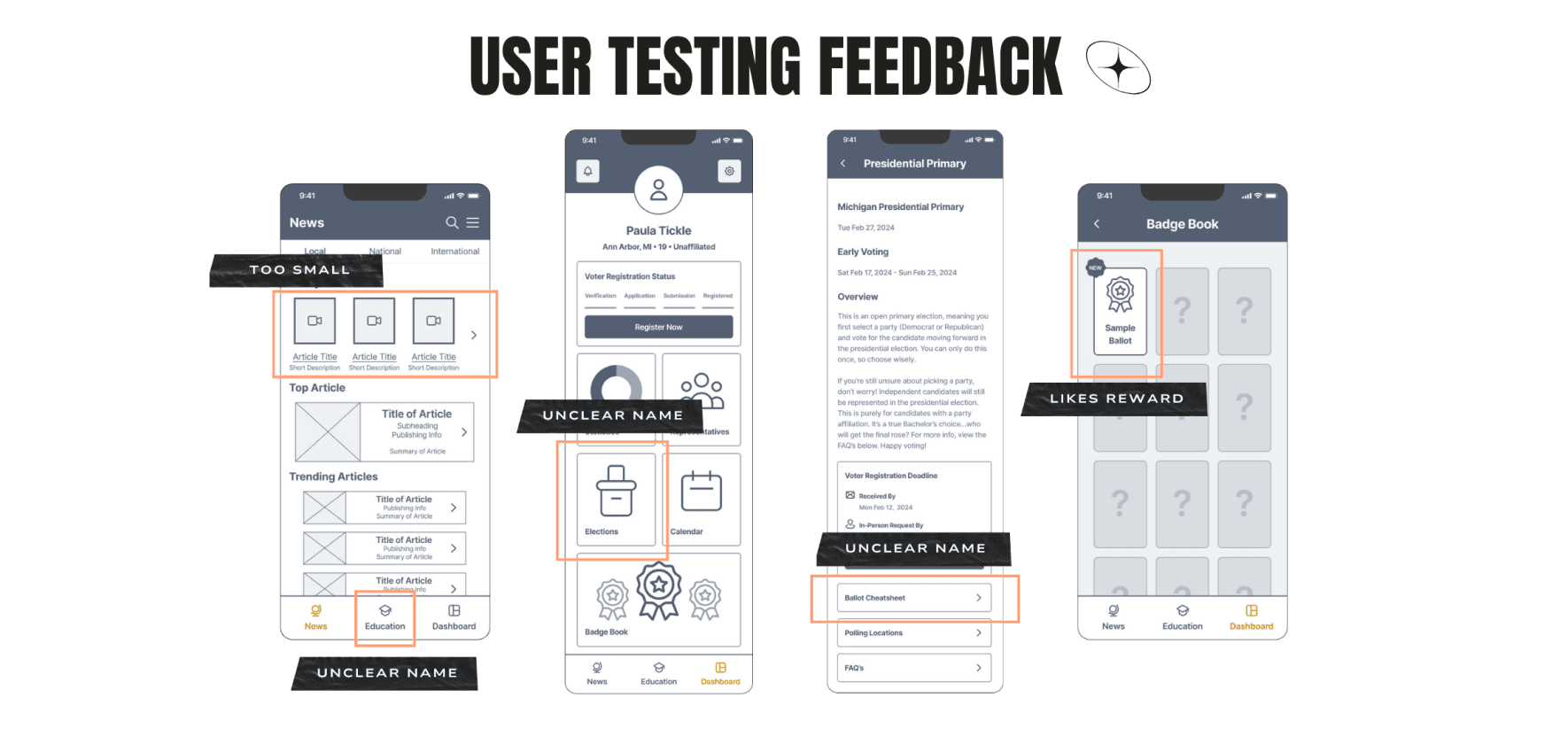
We found that in our mission to educate, we ourselves may have needed a Jargon Buster for our app.
After testing, the overarching consensus:
Lack of clarity in certain aspects of the app language for users.
Sizing hierarchy on the main page yielded intriguing insights.
Conversely, the badge system was a hit! Users expressed a sense of accomplishment and validation through its implementation.
Our Decision? Modern meets Retro a life made in heaven
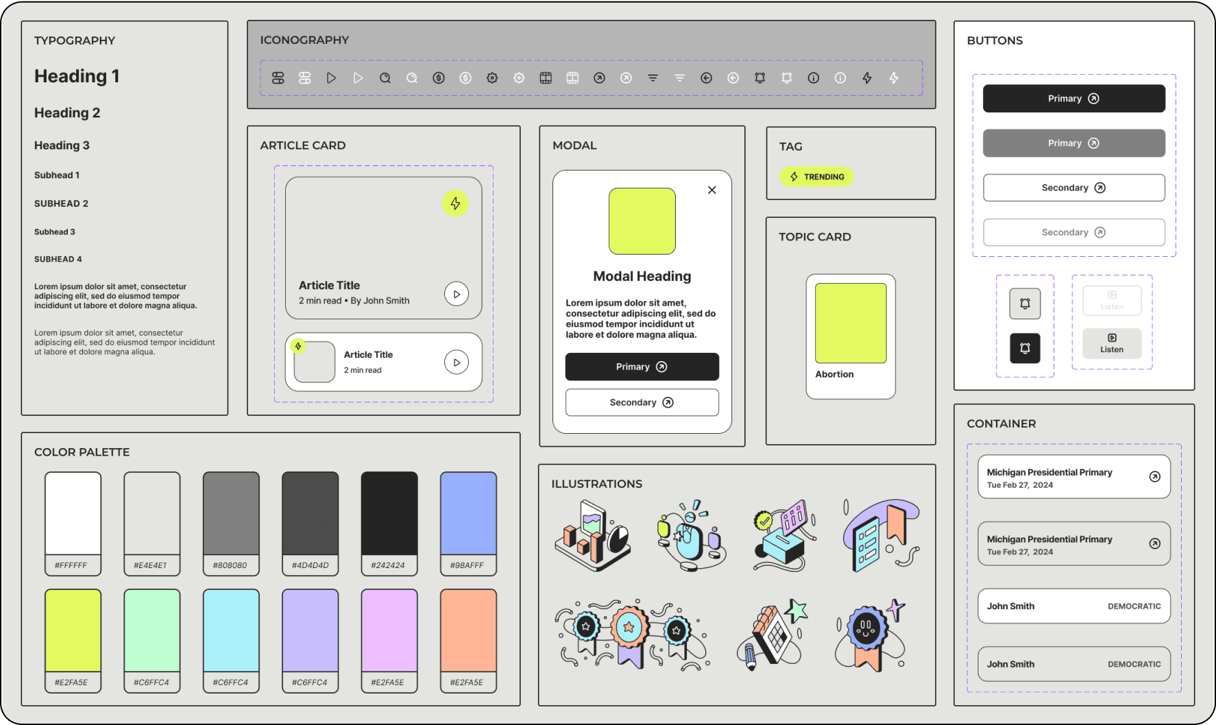
We have opted for a vibrant pastel color scheme infused with a monochromatic retro essence.
Leveraging our rubber hose illustrations as a cornerstone, we aim to strike a balance between contemporary design elements and a nostalgic retro ambiance that resonates with Generation Z, a demographic known for its penchant for emulation.
Word confusion iterations and adding Style to our bare bones
With our style guide as a reference, we proceeded to refine our wireframes with our design elements and our updates from our user testing:
We performed a poll to iron out our word choices for in app features.
Elections —> Voting Prep,
Voting Cheatsheet —> Sample Ballot.
Education- -> Resources
Initial impressions were exciting and honest...
Our next steps are to go beyond!
With our first iteration of Point Blank complete we plan to move onto next steps
We aim to implement certain future states during phase two, which include:
FUTURE A/B TESTING "I would love to find central content creators to highlight in our app."
BUILD OUT BITES FEATURE "I can't wait to add more illustrations to the badge page."
FINE-TUNE OUR RESOURCE CONTENT "I've learned so much about local government from this."
BUILD AUDIO LIBRARY FOR OUR CONTENT - "I’M READY TO VOTE NOW!"
view next project?
© 2024 | Kevin Ruiz
