LIBERATION CAT HOUSE
RESPONSIVE WEBSITE REDESIGN
Role: Lead UX/UI Designer (Team of Four)
Timeframe: 3.5 Week Sprint
Tools Used: Miro, Figma, Photoshop, Zoom
In Southwest Florida alone, community cat populations have reached into the thousands, and colonies with dozens of felines have formed in busy areas. Shelters are overflowing and Fosters are overwhelmed.
How can we help?
We found our Golden Goose
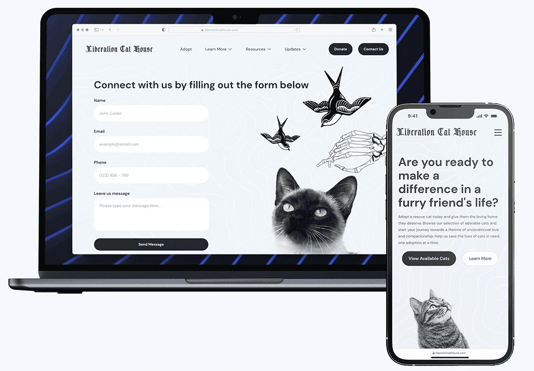
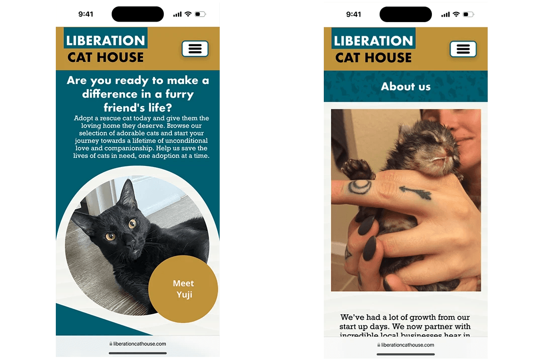
Transforming the Liberation Cat House website into their central hub for adoptions, donations, and inquiries.
The starting point…
I had an old colleague that is constantly posting stories on instagram of all the fosters and their adoption progress and decided to reach out after viewing their website.
She mentioned “We have a website but don’t really use it, we just feel social media is quicker and more user friendly.”
Shareholder interviews were scheduled to get a better understanding of their goals, mission and organization.
We sat down via zoom with their Social Media Director and one of their top performing fosters to gather insights into our key objectives:
During our interviews we learned they have grown exponentially from the creation of their initial website.
They have over 20 foster family partners, 7 Directors, 500 adoptions YTD, and more were being finalized during our interview. They also mentioned that social media has been their main success in getting their cats adopted, backed up by their top performer who consistently posts the kittens or cats they currently have. They also mentioned that they really didn’t know what creative route they wanted, but gender neutral colors were a must.
That was great. We had a better understanding of what they wanted to replicate, ease and deliverability of social media but for their website.
However, a product isn’t going to sell just if it’s easy for the shareholders…
So we performed remote user interviews with participants who have adopted in the past 6-8 months.
We wanted to learn:
A) Decision Making - What decisions do pet owners make when searching for a new companion.
B) Roadblocks - Obstacles that pet owners encounter while searching
C) Preparations - Key sources of information owners depend on when searching for a new pet.
We also sent out a survey of 100 to gather feedback on topics like:
If they had an interest in adopting a disabled or high risk pet?
Whether participants adopted or shopped for pets?
Measurement on how long it took to adopt their current pet?
Whether particpants prefered sponsoring or adopting?
This gave us a better idea that BOTH Adopters and LCH were both looking for an easy way to support their community whether friend or feline.
Adopters had a hard time finding the right pet, and felt like the search can take forever. While they love supporting local community, they utilize search engines like Google and Petfinder for their search.
Since LCH’s website isn’t optimized for search engines that could be a main problem in bringing in adoptions that aren’t following them or their fosters.
Savannah Lyon & Gecko would be the meeting of our two needs, helping adopters and supporting LCH and their mission during the redesign.
How Might We Maximize LCH's mission for increased adoptions and donations?
Using Brainstorming and a Feature prioritization matrix we started narrowing down existing and new features to add and update.
Ideas were clicking, and we were feeling more confident!
After performing heuristic evaluations we had a better idea of how to organize the site, some areas felt chunky with information while others needed some TLC.
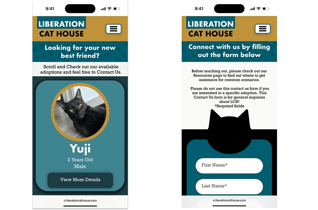
Our main concern was breaking up that information, adding an available cats page, and highlighting the donate page.
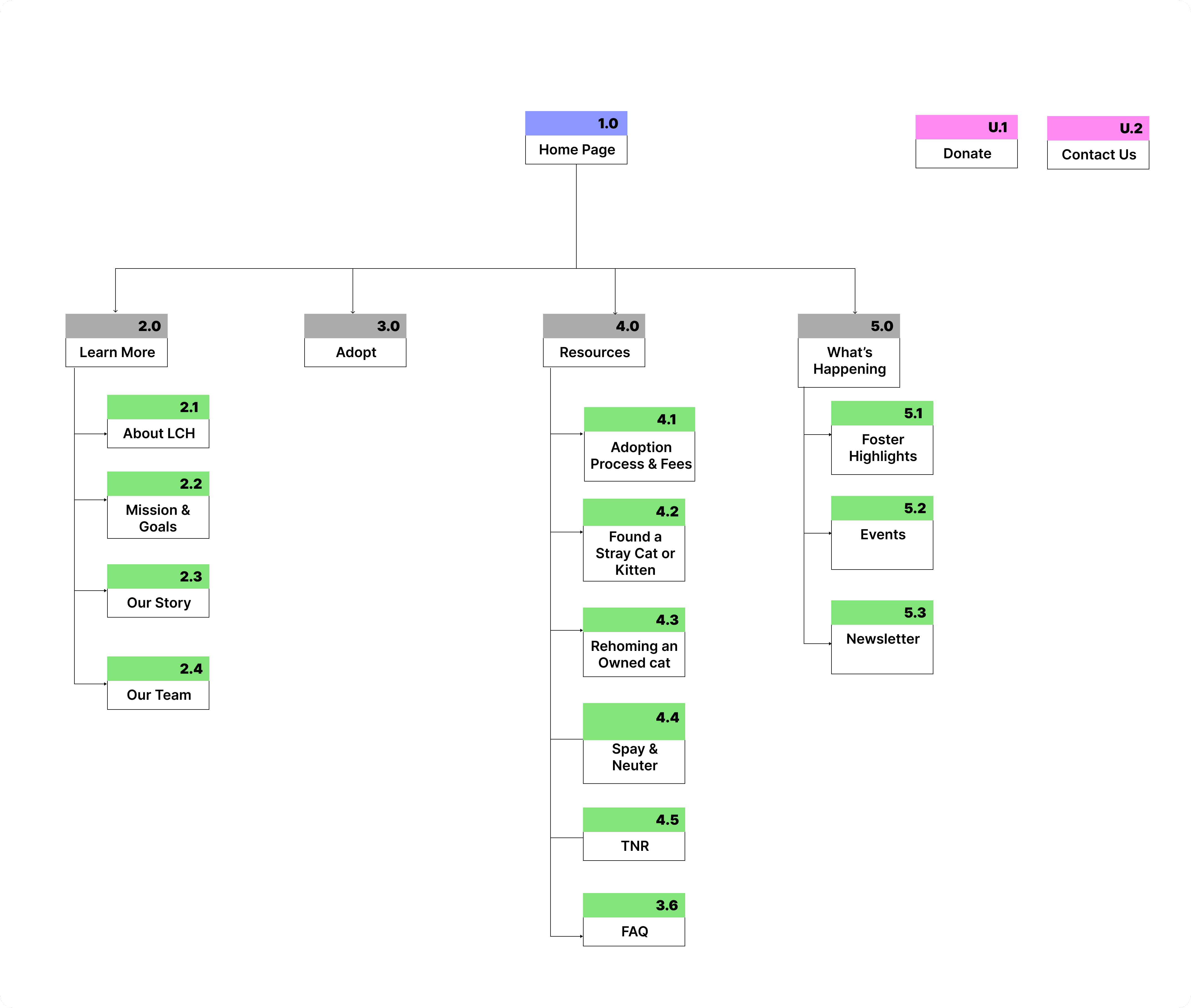
Taking Savannah into developing our User flow we imagined how a new adopter would interact with the refreshed website…
We came up with a flow that allowed the user to review the website's “credentials”, view available cats and request information about one they think they’d mesh well with, and finally reach out to LCH about a separate inquiry.
LCH used Amazon, Paypal and Chewy as their donation sites so we didn’t want to completely up root the way they accept donations by creating a payment profile.
We began wire framing their responsive website with the mobile first approach
After that was complete we also performed user testing to confirm if our information architecture made sense to a new user.
We discovered the main areas of opportunity included interaction design changes was a main priority, and creating a main hub for our Learn More, About and Event Tabs.
Iterations complete, let's bring in the design!
After our stakeholders mentioned a gender neutral color palette they also sent in a calico cat as the color inspiration. We interpreted the color palette as a retro vibe which we could not have been more wrong,..
We finalized the web pages and moved onto our last round ( or so we thought) of usability testing.
We wanted to:
Confirm there weren’t any additional interaction design mishaps we may have missed translating mobile to desktop.
Gauge how user’s felt about the design inspiration and flow.
Users wanted MORE!
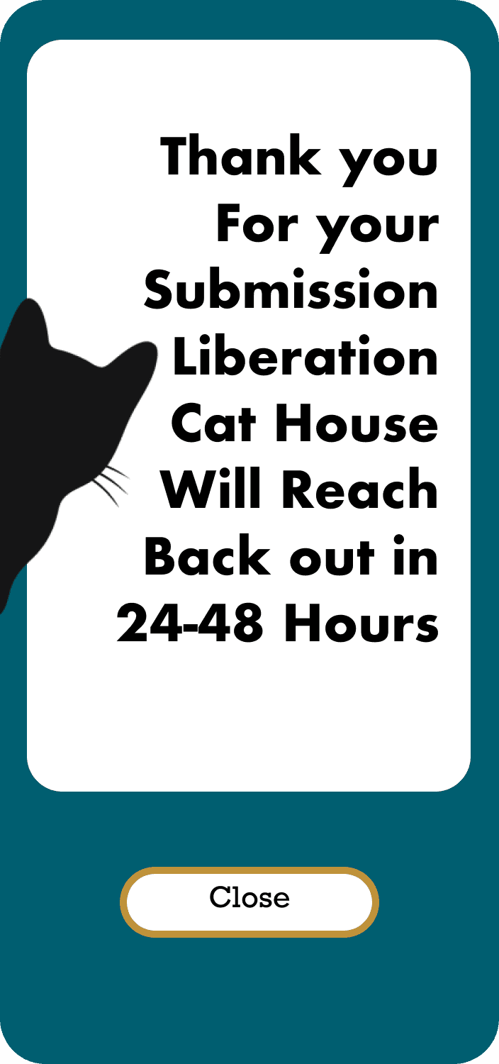
They wanted more confirmation pages overall, from leaving the site to contact us and pet inquiries. They also wanted more cat graphics/images throughout the individual pages.
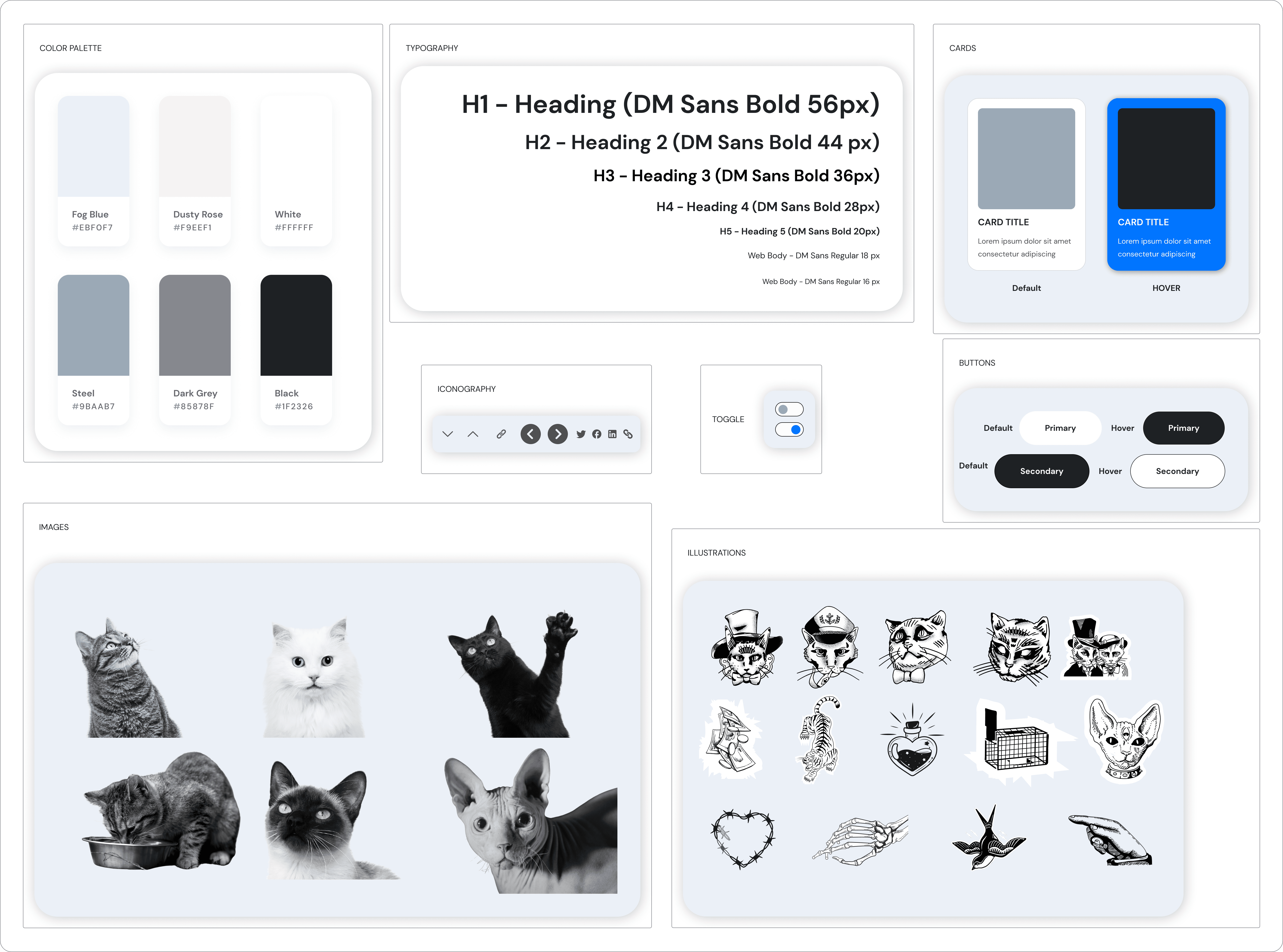
But what the shareholders failed to mention was that their entire organization vibe was edgy, punk and monochromatic. So once the vibe was set we reworked our style guide, pages, and performed A/B testing to determine which version users would enjoy.
Our first design iteration user’s felt like it was dark, outdated, and bit fun with the illustrations
However, our second design iteration user’s expressed a sense of calm, they loved the tattoo feel of it all, one participant even mentioned since cats see in shades of muted blues, grey's and greens it felt pretty spot on to be a cat adoption page…
Oh and the shareholders were so excited to begin the development stage which was a win-win, in that moment we also felt we did right for both Savannah & Gecko.
Next time i’d send a moodboard first
Up next? The real fun starts
With stakeholder approval, We have since partnered with one of the directors who has some experience in front end development so he’s begun working through our designs and coding.
In the meantime we want to brainstorm how we can integrate their third party medical history service to reduce administrative time by auto creating new profiles with new fosters. As well as perform a round of testing with prospective adopters who are using social media to connect with LCH once the site is live.
© 2024 | Kevin Ruiz
